Introduction
This guide is intended for absolute beginners to web development who want to learn how to use Dev Tools (in particular the element inspector). It’s most definitely not a definitive guide, but it does cover a lot of material. If you’re new and a lot of it goes over your head, come back in a bit - you’ll probably get even more out of it on subsequent reads!
If there’s something I didn’t cover or didn’t cover in enough detail & you want to see a better explanation, or if you have any other feedback, please contact me (contact info in footer)! I’d like to maintain this as a relevant resource.
Firefox vs Chrome
This entire article is going to use Firefox. If you want to follow along point-for-point, you need to use Firefox too. Most processes are pretty similar in both browsers, but I recommend using Firefox in general and building for Firefox because
- Most of your users will use Chrome, so they’re likely to send you error reports if they find some edge case. Ensuring your software works on Firefox is up to you, so you should do most things in Firefox.
- It’s vital to support a non-Chromium browser so that Google cannot dictate the future of the internet.
- I think Firefox’s dev tools are overall better anyway.
Opening dev tools
- The best way is to use a hotkey,
Ctrl+Shift+Cif you want the inspector orCtrl+Shift+Kif you want the console.1 - You can also use
Ctrl+Shift+Ito open the most-recently opened dev tools page.2 - You can also press
F12(no modifiers) - If you don’t want to use a hotkey, you can go Tools > Web Developer Tools > Browser Tools.
- Finally, you can right-click on the element you want to inspect (or anywhere on the page) and then choose “Inspect” (or press
Qwhile the context menu is open)
Closing dev tools
Pressing Esc doesn’t close dev tools, it brings up a JavaScript console. To close the inspector you can either:
- Press the X in the upper-right-hand corner of the inspector
- Close your tab if you are done with it (although you will lose any modifications you had made)
- Press
Ctrl+Shift+I - Press
F12
Inspector
Generally, when editing CSS, you’ll want to start on the Inspector tab and maybe also use the Style Editor tab. If you’re really stuck on something, you can check the Console tab too, but usually the Console is for JavaScript.3
Customizing what you can see
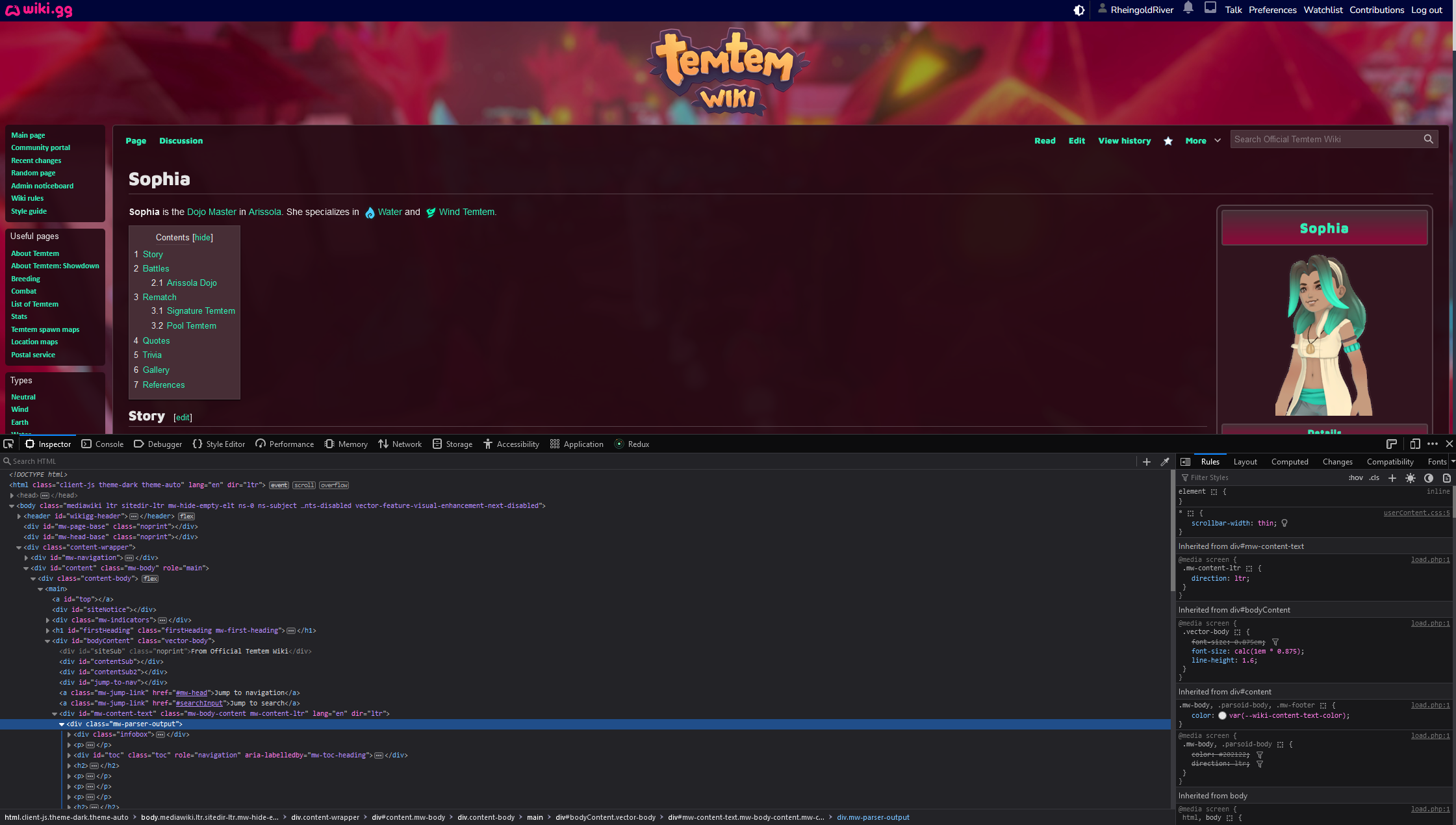
When you first open the Inspector tab, you’ll get something that probably looks something like this:
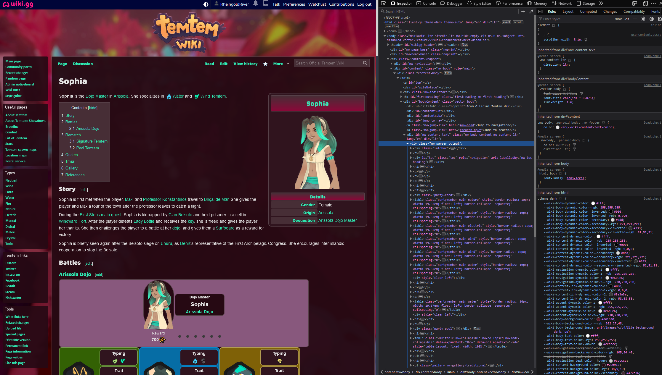
Or maybe it looks like this:
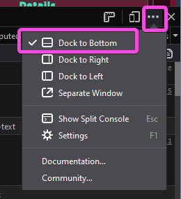
I’m going to keep it docked to the bottom, but it can be useful to dock it in either location (or pull it out to a separate window), depending on what you’re doing. Here’s how you can change that:
If you want to change between Light & Dark, you can open the Settings; and you can also turn on and off some features if you want. If you feel better only seeing Inspector, Console, and Style Editor, and all you’ll be doing is editing CSS, you can probably hide the rest of the tabs. But don’t forget about them!4
There’s one other thing we should configure. Click this button:
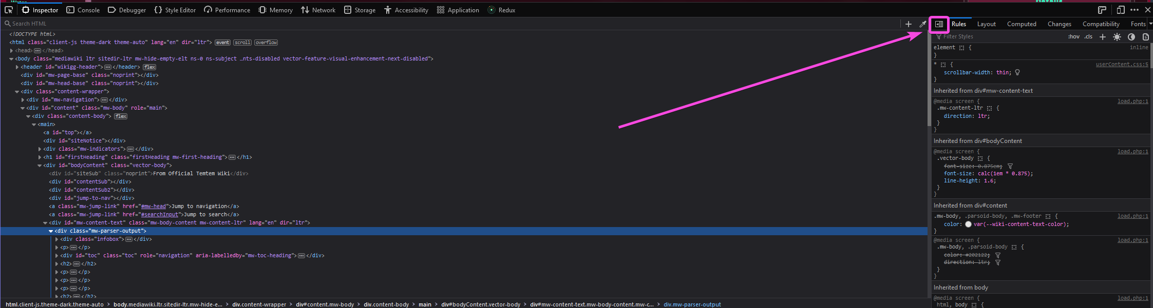
After you do so, you should have three panes across, instead of just two, like this:
The only reason to ever go down to 2 panes is if you don’t have enough horizontal resolution to do so (and this is part of why I almost always dock to the bottom). It’s MUCH easier to do things when you can see all 3 panes at once.
Welcome to the Inspector tab
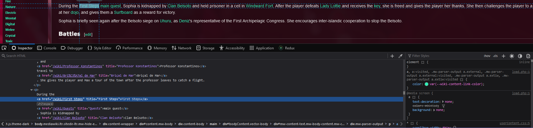
Great, now we should all be looking at roughly the same thing! I’m inspecting the page about Sophia on the wiki.gg TemTem wiki5 if you want to follow along - though I picked pretty much a random article to use as a demo, so it’s possible it’ll look different in the future.
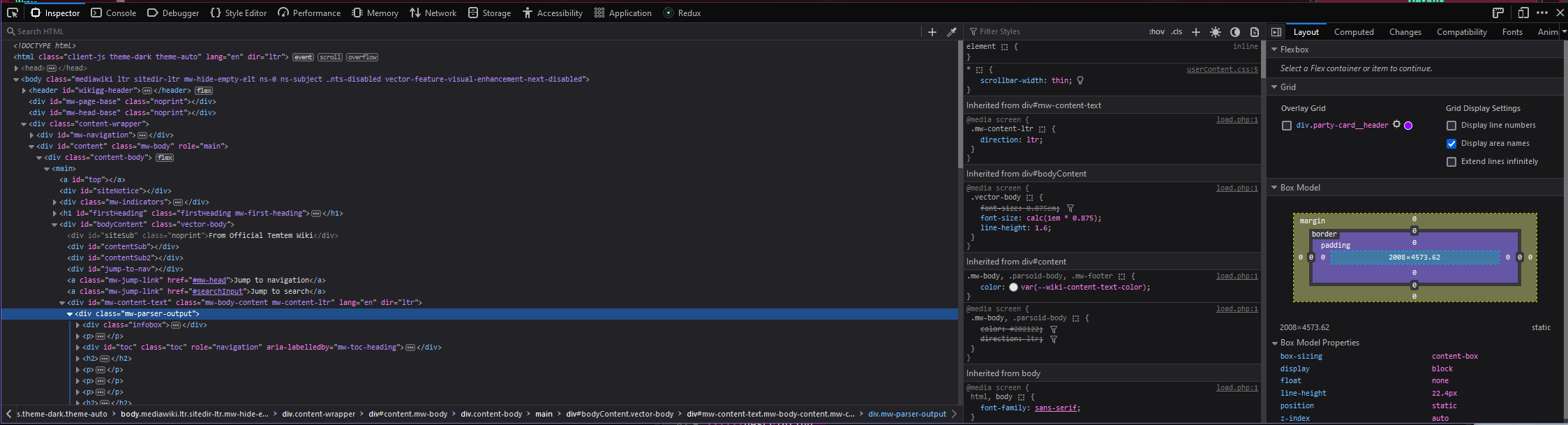
Let’s look at some important/useful features of the Inspector tab:
- This window shows the page’s HTML. You can use the arrows to expand & contract sections (called “DOM elements”), and when you hover an element, the place where it’s rendered on the screen will be highlighted, assuming it’s within your current viewport. If not, you can right-click it and then say “Scroll into view.”
- This field lets you filter styles. For example, if you know you’re looking for something to do with color, you can write
colorhere and then you’ll see only rules where a property name, selector name, or property value includes the stringcolor. - This area (the “Rules” tab) shows all of the CSS rules that are applying to your currently-selected element (possibly filtered by what you wrote in section 2). If a rule is crossed out, it means that it’s being overridden by something with higher specificity.6
- The Layout tab is one of the two most-useful tabs in the right-most pane.
- The “Computed” tab is the other one you’ll go to a lot, and we’ll take a look at it later.
- This “Overlay Grid” shows up any time there’s a CSS Grid element on the page, and you can get an overlay showing you the grid regions. Super useful when it’s relevant.
- The “Box Model” pane shows you the general “shape” of the element you currently have selected. If you don’t know that phrase, you can read about the box model on MDN. But briefly, it means that the space an element “takes up” is defined by:
- The margin outside of it (margin box).
- The border at its edge (border box).7
- The padding between its edge & its content (padding box).
- The space that the content takes up (content box).
- Toggle Element Picker. In part 1, we saw how to choose an element to look at by clicking the HTML & then finding it in the rendered content. What if we wanted to do the opposite - hover over the content window until we find the element we care about it, and then see it in the Inspector window? This is how.
- If you open the inspector via
Ctrl+Shift+C, the Element Picker is enabled by default. This button is a toggle, so you can turn it off by clicking here too, if you don’t want to actually pick an element.
- If you open the inspector via
Using the Element Picker
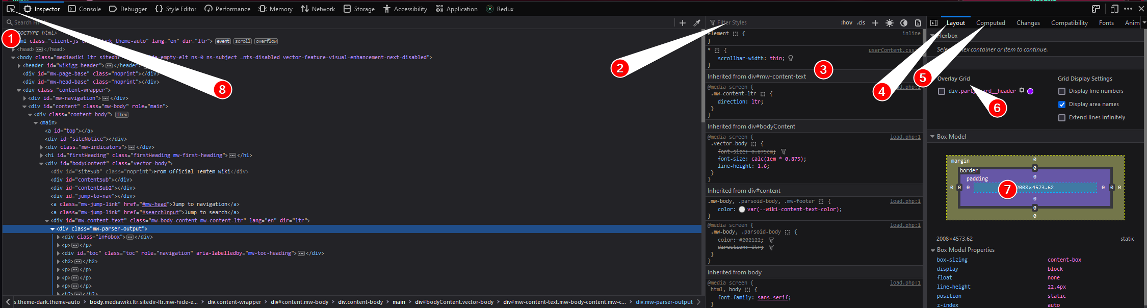
Let’s look at what happens when we use the Element Picker:
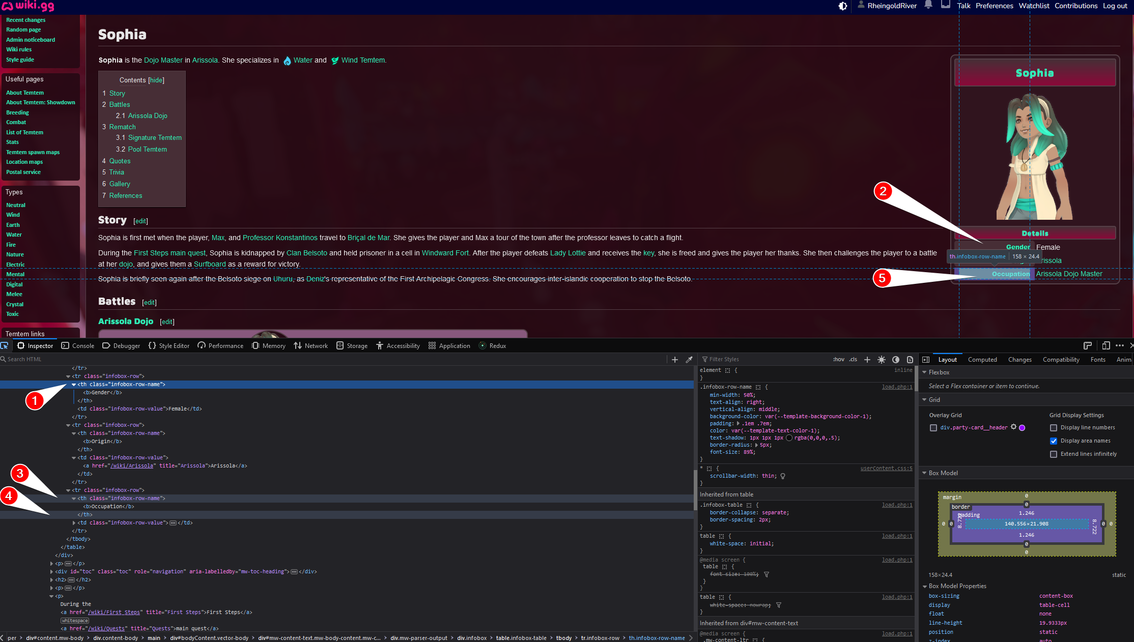
- The HTML of the cell I had selected before I entered Element picker mode is still highlighted
- This is the cell I had highlighted before.
- The currently-highlighted opening tag.
- The currently-highlighted closing tag.
- The element I’m hovering right now. Notice it’s highlighted in blue, and it tells me a bit of information about the node8 in a tooltip.
A couple other things to notice:
- All of the information in the two right windows are about the previous node. That won’t change in real time while you pick, but once you click the new node it’ll switch over to it.
- If you’re inspecting a page you yourself created or edited, the HTML should look pretty familiar. It’s showing you the content, elements, CSS classes, and inline styles that you wrote - this is literally the HTML that the page is displaying right now.
- Sometimes, it can be a bit difficult to select the exact right node that you care about. If you’re having trouble, click the nearest ancestor you can easily select and then start expanding its children by hand in the HTML viewer.9 You can also right-click a node and then choose “Expand all,” although sometimes there will be many, many nested elements and you’ll get more than you wanted! You can undo an “expand all” by right-clicking again and choosing “Collapse all.”
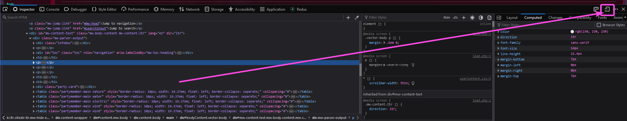
The “Computed” tab
I promised we’d talk about the “Computed” tab, so let’s do that. Here’s an example tab:
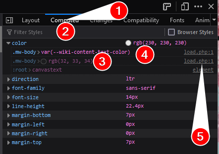
Here, we’re looking at:
- The current tab (Click “Computed” to get here)
- Just like in the middle tab, there’s a filter here. These lists can get REALLY long, so you might want to search for something like
positionorcolor. - The left-hand column shows a list of rules affecting the given property. In this case, there’s 3:
- The class
.mw-bodyhas acolorvalue ofvar(--wiki-content-text-color). - The class
.mw-bodyalso has acolorvalue ofrgb(32, 33, 34)- but that’s located earlier in the stylesheet than the first rule is, so it has lower specificity. - The root element of the document (represented by the pseudoclass
:root) has a color with valuecanvastext. Don’t worry too much about understanding this, but know that it’s the rule with the least specificity.
- The class
- The current value of the expanded property on the currently-selected element.
- A link to the CSS implementing this rule. If you click this, you’ll be taken to the Style Editor tab, and you can edit the raw CSS and have it live update.
The “Computed” tab is generally used when you want to know why some property on an element has its value, and not just what that value is. Here are some reasons you might need to use it:
- You can’t figure out which ancestor element is giving your current element its color (or other property).
- You want to change a rule, but you don’t know which element to change it on, so you look here on some random child & then locate the correct ancestor.
- You wrote a new rule and it’s not showing up, so you want to check:
- How much specificity do you need in order to override the existing rule?
- Is your new rule actually targeting the correct thing, even if it’s not specific enough? If it is, it’ll show up in this list, just maybe not as the first thing.10
- You want two unrelated elements to have the same value for some property, so you go here to find what the current value is (perhaps inherited from somewhere else) & then copy it.11
The “Rules” tab
The “Rules” tab is the middle tab in the three-column layout. You’ll likely spend a lot of time here, so let’s look at each part individually.
For this entire section, we’ll work on modifying this link:
(The screencap is cropped to make it easier to read & because the right-most tab isn’t relevant to this discussion.)
Toggle pseudoclasses
What if we wanted to see how it’s going to look while a user is hovering it? Or check if it looks different when visited from unvisited? Or when it’s active (in this case, while a user is actively holding down the left-click button on the link)?
Of course, we can perform these actions for real, but that makes it kinda hard to use the inspector tools at the same time. Better is to artificially trigger a pseudoclass!
Here’s how we do it:
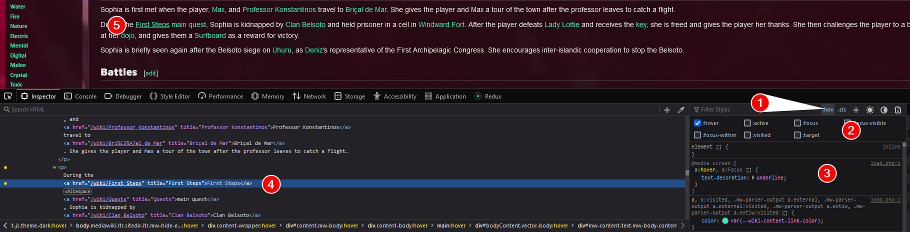
- Click this button to toggle open the menu.
- The new menu. You can choose any number of available pseudoclasses at the same time.
- Look at the rule that’s now showing up because we selected
hover! - The HTML of the element we’re looking at, highlighted in blue. Notice the yellow dots on the left. If you hover one element, you also hover all its parents! That’s not true for all pseudoclasses, though.
- The rendered view of our link, which is now underlined!
Add classes
The next button lets you toggle visible classes.12 You can also add a new class here, which will actually modify the DOM and add it to the list of classes that the current element has. Once you’ve added a class like this, you can also toggle it on and off.
Editing the DOM/HTML inside of your inspector is a very powerful ability because it helps you preview HTML changes without editing code or reloading the page.
Add new rule
Adds a new rule that will style the currently-selected element. It guesses at a selector that you might want to use, and then you can edit the selector and also preview any styles you might want to.
Let’s look at an example:
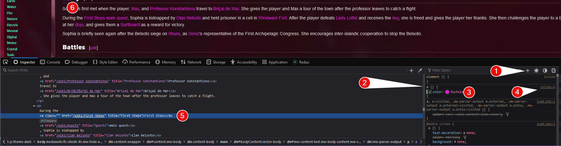
- I clicked this button.
- The selector it thought of was
a, because the link I clicked has no classes on it and also no ID. To the best of my knowledge:- If your element has an ID it uses that, no question.
- Otherwise it attempts to use classes as a selector. If you have multiple classes on this element, it will pick all of them, like
<div className="class1 class2"></div>would get.class1.class2as the selector. - Otherwise it falls back to an element selector, as in this case.
- Here’s the rule I added:
color: fuchsia. Note that you can edit the property name & value independently. If you’re following along, try changingcolortobackground-color. Then try changingfuchsiatoredorblue.13 What happens? - The most important reason (imo) for adding a custom rule: It automatically creates a new custom stylesheet and links to it. Then you can click this & edit a custom CSS file to your heart’s content.
- This is the currently-selected element (notice its class list is empty, and it has no ID).
- Now all our links are pink (well, fuchsia)! And it’s really all of them, because we added a new rule applying to all
aelements.
Theme toggle
If your webpage is responding to prefers-color-scheme, you can use the next two buttons (the sun and the moon) to turn on “force prefers light” and “force prefers dark.” If you’ve hard-coded some preference on the website and there’s some code overriding your “prefers” setting, these buttons might not work.
The last button
I have never in my life used “Toggle print media simulation for the page,” but I don’t know, maybe you want to be printer-friendly.
The “element” selector
The element selector lets you simulate inline CSS. This is useful because it lets you easily apply rules to just this one node, but it can be a bit of trap because you probably14 are not writing inline styles in your HTML, so you’ll get lied to about specificity.
Let’s go on a tour:
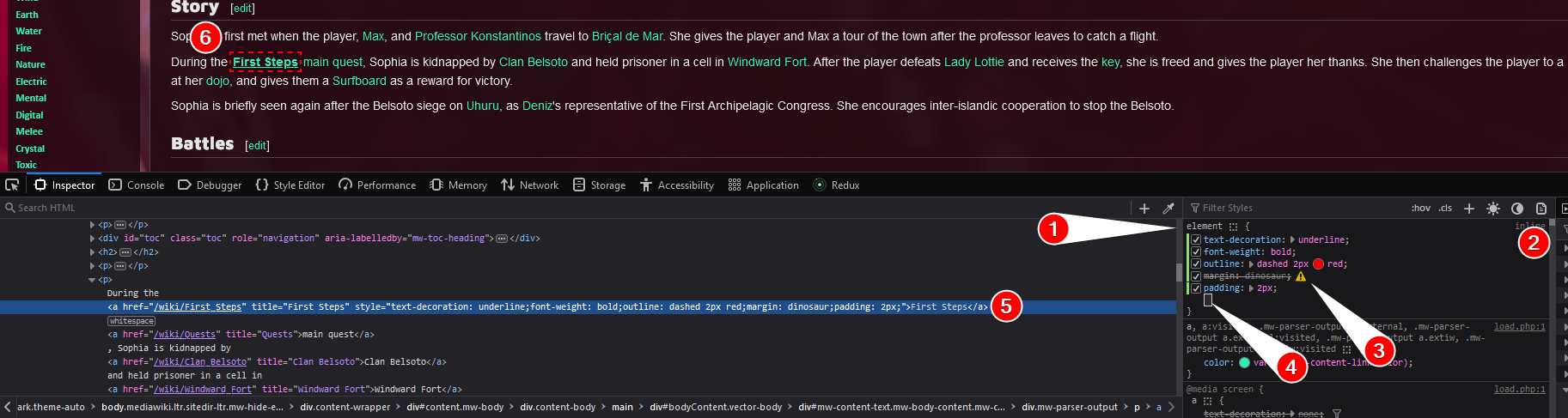
- The selector. The “element” selector will usually be at the very top of the list, but if there are pseudoelements (
::before,::after)15, those will display above this.elementis not a real selector; you can’t write that in a stylesheet. It’s just what the browser displays to say “edit the current element.”
- Instead of a link to a stylesheet, it says
inlinehere. - If a rule is invalid (in this case,
margin: dinosaur;) it will show a hazard sign. This is true of every rule in the list, not just on the current element. - Click here to add a new rule. You can press
TaborEnterto autocomplete, and also scroll within a list of available options from a pop-up menu as you’re typing. While an option is hovered, it will render in real-time in your display; this can be really useful if you can’t remember which value to use forjustify-contentin your flexbox styling. - The currently-selected element. Notice that all of our changes are physically edited into the HTML. The rules list, HTML, and live display will always all be synced to each other.
- Look at our change!16
Editing rules
You can edit selectors, property names, and property values by clicking on them. You can also temporarily disable or re-enable certain rules by unticking or re-ticking their boxes. Play around with it a bit and redesign the entire webpage!
Color information
Responsive design mode
If you want to see how your design looks on mobile, you can shrink your entire window to the size of a smartphone. But that’s pretty annoying - it also shrinks your dev tools, and if you have 100 tabs open that’s kind of a pain too.
Fortunately, there’s a built-in way to shrink your viewport to the size of a mobile device, while keeping everything else the same size. This button right here:
When you click that, you’ll get something that looks like this:
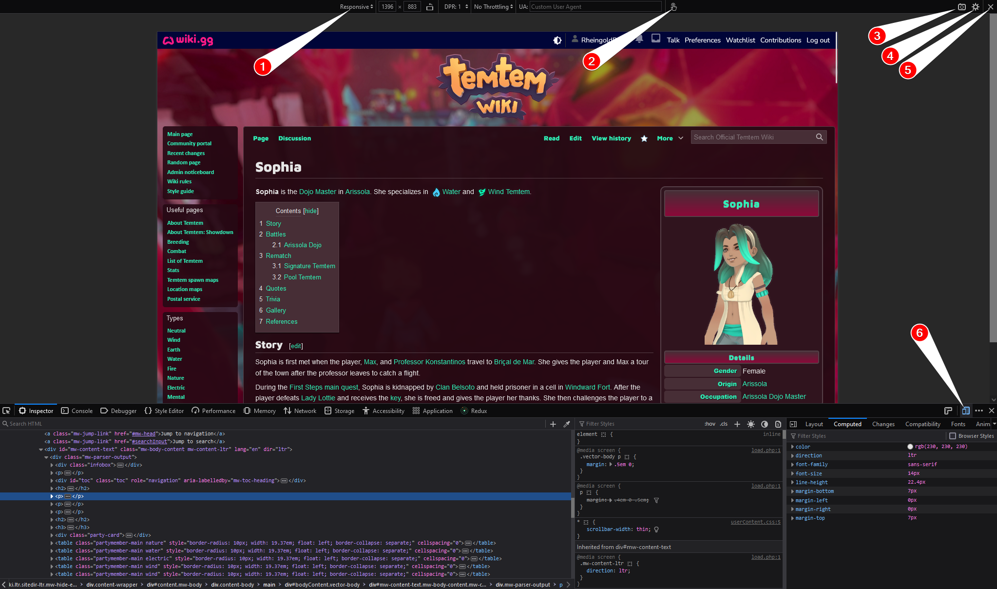
- This is a dropdown where you can select different common device resolutions. You can also manually set the resolution by typing into the fields for width & height.
- Toggle how your mouse behaves: like a mouse or like a touch/tap input. This can be super useful if you’re writing event handlers.
- Take a screenshot of your current viewport. This action will save the screenshot to your default downloads location; if you are on Windows and haven’t configured anything, this will be something like
C:\Users\River\Downloads(replace “River” with your username). - Open some settings, which e.g. lets you left-align instead of center-align the viewport.
- Exit responsive design mode (return to normal view).
- Also exit responsive design mode by re-toggling the “open responsive design mode” button.
All of the dev tools work pretty much the same way in Responsive Design Mode; you can use the style editor, console, etc, just as normal.
Style Editor
The style editor will look something like this if you open it in the way I described above, by adding an empty rule and then opening its stylesheet:
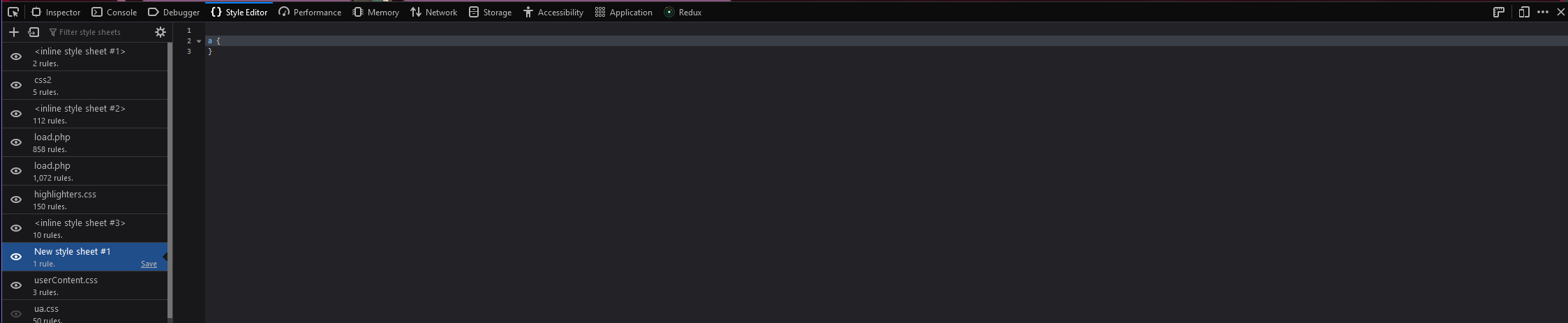
You can toggle sheets on and off using the eye button on the left-hand side, which can be pretty useful if you want to compare a before-and-after of a bunch of edits you’ve made. Changes also show up in real time from here, so this is one of the best ways to test CSS.
The one downside is that if you navigate away, you instantly lose all your changes with no hope of regaining them. For this reason, if you want to test extensive changes, I recommend using the Stylus extension. Create a new sheet for your current URL, save it once, and then after that initial save all your changes will show up in realtime.
Note that in both of these cases (using the Style Editor pane & Stylus extension), your new CSS will be physically at the bottom of all loaded stylesheets. So, if you create a rule with equal specificity to an existing one and then paste it above that original rule, your new rule won’t apply. You need to make sure you either keep the same order or add extra specificity here.
Console
Do NOT paste anything here unless you understand what it does. Especially do not paste code given to you by a stranger!!!
The Console tab lets you run and test JavaScript. I sometimes open a console just to check JS syntax because the UX is pretty nice as long as you don’t need any libraries; for example, try typing 4+4 and notice that it previews 8 even if you don’t execute it. (However, I am probably a stranger on the internet, so type nothing into the browser console that I tell you to, unless you understand what it does.)
More importantly (imo), the console is where any errors and logs will display. Print-based debugging is the best, so sprinkle console.log('kittens') and console.log('case 1') console.log('case 2') console.log('case 3') when your code doesn’t work and look at the results.
Inspecting hover tooltips
If you are trying to inspect a hover tooltip that’s implemented with CSS, you can artificially hover the element by using either the pseudoclass editor in the middle pane or by right-clicking on the element inside the HTML view.
But if the tooltips are implemented with JavaScript, you might have a bit of a harder time. To inspect tooltips that are loaded and unloaded with JS based on mouse position, do the following:
- Hover the element so that the tooltip shows
- Press
Escto bring up the console on top of the inspector - Type
debugger - Press enter. This will pause all JS events on the page, including the one that was hiding the tooltip when you moved your mouse.
- Use the element picker to pick your element. Once you select the element picker, the translucent layer in front of your viewport will go away.
If you have another method to disable JS with a hotkey, that works just as well!
Storage
The last tab I’ll talk about is Storage - in particular, you can edit your Local Storage from here, which is super useful if you’re interfacing with localStorage from an application and need to clear your values, manually change them, put something invalid to see how your code behaves, etc.
Further resources
The reason I wrote this post is I know of literally no resource about using Dev Tools. But here are some useful resources about CSS:
- CSS Grid Garden - learn CSS Grid
- CSS Flexbox Froggy - learn Flexbox
- Stylus for Firefox - my recommended style editor (also linked earlier)
- freeCodeCamp - probably the best place to learn beginning HTML & CSS (it’s free, friendly, and very interactive with a lot of playgrounds to practice & play with)
-
Or be like me and always press
Ctrl+Shift+Cand then click over to the console if you need to, becauseCtrl+Shift+Cis easy to press with one hand andCtrl+Shift+Kisn’t. ↩︎ -
This shortcut won’t preserve your tab if you’re using the React dev tools, because those load on a delay when you open your inspector; instead it’ll open the Inspector tab. ↩︎
-
Recently, I had an issue with a
::beforepseudoelement not displaying a background-image SVG. The cause was discovered in the console: There was a Content Security Policy (CSP) preventing it from working! ↩︎ -
Personally, I use Inspector, Console, Debugger, Style Editor, Network, and Storage regularly. I’m also a fan of the React Dev Tools when writing React code. ↩︎
-
I know nothing about TemTem; I picked someone at random from the Characters page. No idea who Sophia is except that she’s the Dojo Master in Arissola. ↩︎
-
See also my favorite Specificity resource, Specifishity ↩︎
-
Generally you want to set
box-sizing:border-box;- it’s not default but it’s the easiest to work with. Usually this is done in something called a CSS reset. ↩︎ -
“Element” and “Node” mean pretty much the same thing, and I’ll use them interchangeably. ↩︎
-
If you are styling OOUI forms in MediaWiki, this will happen constantly. It’s super annoying. ↩︎
-
Another trick to see if you’re targeting the right element is to add
outline: 2px dashed red!important;in your selector and see if it shows up. But don’t do this in a production environment. ↩︎ -
In this case, you should likely be using CSS Variables. ↩︎
-
To be honest, I never use this; if I want to change the classes I always edit the HTML directly (by double-clicking inside of the list of classes and then changing it). But maybe I should. It seems like it would be especially useful when using a framework like TailwindCSS. ↩︎
-
You might have read that it’s not great to use named colors, better is to use hex values or RGB colors. This is true. However, in a demo like this, named colors are easier to see at a glance and understand. ↩︎
-
I hope ↩︎
-
Don’t get confused between pseudoelements and pseudoclasses. They’re pretty unrelated. Sorry. ↩︎
-
Unfortunately there’s no dinosaur-filled margin. ↩︎