It’s been a while since I did a gadget-tools post, but with the new FandomDesktop skin approaching, I wanted to catch up on some while my screenshots still look somewhat like vanilla MediaWiki. In this post we’ll go over how I use flexbox and flex-order to make categories show up at the top of the page (but only in the Module namespace).
(Note: All code in this post was originally written by me for Leaguepedia and is licensed under CC BY-SA 3.0.)
Motivation
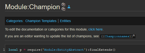
Categories in the Module namespace are core navigational elements. They’re also frequently core informational elements: “What does this unfamiliar piece of code do?” can often be answered by the category that a module is in. Modules, unlike templates, display their full source code to the reader, and so categories are by default located dozens to hundreds, or perhaps even thousands of lines down the page. It’s therefore desirable to reorder page elements so that categories are located above the code, instead of below it.
Why do this only in the module namespace if categories are so great?
- Modules are somewhat unique in that their contents cannot be altered to provide any navigational benefit to the user; if I think a particular category is a valuable contribution to a player page, for example, I will include it in the player’s infobox, but such a thing is not possible in a module.
- Modules tend to be extremely long, so bottom-of-page categories are just farther away from the top of the page than they would be on other types of pages.
- Modules and templates tend to be only in one or two categories; therefore, there’s a high signal-to-noise ratio in the set of categories present. Because templates don’t show their source code and typically aren’t particularly “tall,” they don’t really require this modification.
Code
|
|
Explanation
Before I talk about Flexbox a bunch, just a quick note that every namespace is selectable by its namespace number and the prefix ns-. So if you want to apply a customization to templates, you can do .ns-10. User namespace is .ns-2, etc. All of these classes are present on the body element, so check that out in inspector if you want to see what’s available.
(And by the way, I suggest taking some time to memorize just a couple of namespace numbers. It’s pretty useful to know main, user, template, and Module at least. You can look them up by checking out the URL at Special:AllPages after selecting a namespace by name from the dropdown.)
Okay, let’s talk about Flex!
Whenever we want to “reorder a bunch of stuff,” there are two main things to turn to: Flexbox and Grid. If all the stuff is one-dimensional, including one-dimensional but folded/snaked up inside of a two-dimensional space, use Flex. If the stuff is truly two-dimensional, use Grid. Another way to put it is, “Grid is for layout, Flex is for content.”
In this case, the stuff is decidedly one-dimensional: it’s just a column going down the page, and so we’ll use Flex.
CSS Flex can go either across the page horizontally, in which case it’s flex-direction: row, or down the page vertically, in which case it’s flex-direction: column. It can also go backwards, either row-reverse or column-reverse. In this case we want regular top-to-bottom column. To start the flexbox, we apply the display:flex; along with the direction rule to the container, which is .mw-body-content.
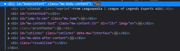
Now, for the fun part! We get to re-order everything on the page! We look through the inspector with every element collapsed and decide where in the ordering it should go. I decided to give a unique order to everything, but that’s not necessary; you could, for example, give all of the first stuff 1, then #catlinks gets 2, then #mw-content-text gets 3, and everything after that gets 4, and that would be fine too. It’s pretty FLEXible hahaha. Haha.
If you’re not familiar with Flex, I recommend css-tricks.com’s complete guide to Flexbox. They have a poster version, too!
Negative orders
Note that orders can be negative. So if all we wanted to do was make #catlinks be the first thing, we might just do this:
|
|
That would put #catlinks before everything else (in the display, you still aren’t actually editing the html), and leave the rest of the order untouched.
Extra bonus
My Discord client overlaps my Firefox browser on my center monitor. When I watch YouTube videos, my Discord client overlaps the edge of the YouTube video. Oh no!
So I applied one css rule to the YouTube website:
|
|
Ahh, all better now.
Conclusion
Flexbox lets you fix everything.
I meant that to be just the first sentence of my conclusion, and I was going to write more, but to be honest that seems pretty appropriate. I’ll leave it at that.